


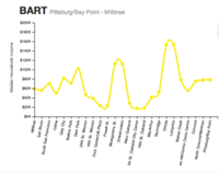


This probably isn't news, but there's some pretty stark income discrepancies between certain neighborhoods of our fair city. What is news is that while most of us are aware that the rich people live in the Marina and the poor(er) people live in the Tenderloin, the income gaps can vary widely from one short BART stop to the next.
Two local software developers — Dan Grover and Mike Belfrage — were kind enough to design an
interactive mapof San Francisco's public transportation, illustrating the money-making patterns along all the routes of BART, Muni, and CaltrainDistressing disparities obviously emerge between certain stations. In San Francisco, the Powell BART stop attracts those people with the “how-the-hell-do-you-live-on-that” average income of $23,000, while just down the road the Montgomery stop is livin' lushly, with incomes reaching $112,000.